One of the most interesting things about UX is that it’s all around us, whether we like it or not! While there’s a user experience involved in using our favorite social media platforms, there’s also one involved in chewing a piece of gum.
This makes the world of UX dynamic and fast-paced, with a lot of factors influencing its direction. Staying up to date with upcoming trends in tech and product design is crucial to being an effective UX professional. But with so many news sources, it can be difficult to wrap your head around it all.
To help you start the new year off on the right foot, we’ve done the heavy lifting and put together a list of nine UX trends to watch out for in 2019. Keep reading to get on top of your UX game this upcoming year!
1. The Trend: An Increasing Need to Design for Accessibility and Older Audiences
It’s no secret that technology has permeated nearly every aspect of our everyday lives. People now have access to smartphones, the internet, tablets, and more devices at increasingly young ages.
On the other hand, adults and seniors are also becoming more and more connected in their everyday lives. You may think that your grandmother doesn’t need a smartphone, but “the share of adults ages 65 and up who own smartphones has risen…from 18% to 42% since 2013” according to Pew Research Center.
Combine this trend with medical advancements and you have an aging population with an increased quality of life. However, there is only so much technology can do to design for the effects of aging. This poses an ever-evolving challenge for UX designers and researchers as the definition of what a ‘typical user’ looks like is widening. In response, the usability of everyday technology needs to catch up with its users, not the other way around.
When examining accessibility, it’s important to keep older users in mind. For a senior audience, some factors to consider include limitations of memory and attention span, as well as visual impairment. Motor limitations can affect a user’s ability to interact with mobile phones, keyboards, touch screens, and lots of other accessories. Think critically about the accessibility of things like font and button size (AKA clickability) and how much mental effort you are asking users to exert.
The usability of everyday technology needs to catch up with its users, not the other way around.
Why you should care: The spectrum of people that products and technology are designed for is widening. Inclusivity and accessibility are only becoming more important and beneficial for everyone because broad access to technology is influencing all of us, impacting everything from our attention spans to the way we read. While this may be challenging, it’s not necessarily a bad thing. In many ways, it’s an example of the curb-cut effect, a phenomenon where making something more accessible for one group of users actually improves the experience for all users. In many ways, accessibility is not just the right thing to do, it’s also the smart thing to do.
2. The Trend: Responsibility in Design
The question of responsibility in design has become a prominent theme in 2018, and we don’t expect this to change anytime soon. As technology becomes our constant companion in everyday life, we have to keep in mind the great responsibility that comes with being able to design or influence the experience of that technology. This begs the question: where does that responsibility end and where does it begin?

This year, the Qualaroo team attended two World Usability Day events, one in San Antonio, Texas and one in Silesia, Poland. The theme for both events was Design for Good or Evil, so a consistent point of conversation was the increasing responsibility placed on UX and product designers. You can read more about what was discussed at the San Antonio World Usability Day here.
While the answer to where responsibility in design begins or ends is unclear, we predict that conversation will continue to develop and become more nuanced throughout 2019.
Why should we care: Questions about the implications of UX design may affect the UX process or redefine its role within organizations.
3. The Trend: Consistency
Another trend for UX professionals is striving for consistency of experience. In particular, this deals with cross-platform experience and capabilities. This is incredibly challenging when you consider that you have to balance your own branding rules with OS and platform requirements across all devices – iOS, Android, TV, tablet, desktop, etc.
It’s important for UX researchers and designers to acknowledge and design for a user experience that jumps from a company-issued laptop to a personal smartphone to a tablet and back again. This is the reality of the average consumer’s technology stack. Understanding how to create a smooth experience across all of these channels is not only important, but it is also challenging when the latest operating system version or smartphone model is a moving target, making accounting for all possible variances a big undertaking.
Remember that users don’t compartmentalize their impression of a brand based on a single point of interaction. When asked about a particular channel or activity, most users will respond with an opinion informed by their holistic impression of a brand, so ensuring a consistent and positive experience should be every team’s goal.
Bonus: Having trouble deciding where your experience may be falling short on consistency? Try asking some of our top questions for product owners.
Why you should care: If you work in a large company where there are different owners of various channels, you will need to collaborate effectively in order to create a consistent experience.
Users don’t compartmentalize their impression of a brand…. So ensuring a consistent and positive experience across all channels should be every team’s goal.
4. The Trend: Collaboration
Another trend in UX is collaboration. While it’s no secret that UX has always been a team sport, we forecast that collaboration via tools will become even more essential. We are seeing more and more focus on design systems’ functionality in prototyping tools like InVision, Sketch, UXPin, Axure and more.
As UX teams grow, they have to learn how to cooperate not only as a core unit but also with external partners like agencies and contractors. As part of this trend, design systems will also become must-haves, as opposed to nice-to-haves. A design system is the aggregate of rules about style and branding that communicate what a product or experience should look like and how it should behave. It can inform everything from information architecture to button design to shading gradients.
Why you should care: Collaboration within UX tools is essential to creating a holistic experience and will have implications for the practices that need to be put in to place to encourage cooperation and consistency.
5, 6, & 7. Sensory Trends: Gesture-based controls, Voice User Interfaces, and Sound Design
We’ve grouped these three trends together because they are different sides of the same coin: experiencing our technology in a way that includes more of our senses. We expect that these trends and other related ones will impact each other and even begin to work together in new ways.
An increasing use of sensory factors means evolving consumer expectations and of course changing the way we test usability…. The UX field will have to adapt accordingly.
Gesture-based controls, or using a particular action to signal a specific function, is not a brand new concept. In fact, many mobile apps have been using gestures for some time now. For example, Instagram stories use a “swipe up to learn more” feature to share links with viewers.
Generally speaking, old UI navigation systems have changed, and we predict gesture controls will become more and more common. One consideration for using gesture-based controls is accessibility. For example, users with limited mobility may not be able to make use of swiping motions or actions that require using thumbs. Both iOS and Android have changed navigation from standard buttons to specific gestures. For people with motor or cognitive limitations, it’s more difficult to make precise gestures than it is to press a button. We doubt that this will slow down the growth of these types of controls, but accounting for varying levels of accessibility will be an important consideration.
Voice-user interfaces (VUIs) are another trend we are seeing. Siri and Alexa are probably the most popular examples of a VUI in action. In fact, Siri owns 46% of the mobile voice assistant market, while a 2017 report estimated that at least 8.2 million people own an Amazon Echo.
VUIs are simple and mostly intuitive. If a user says a specific term, then the interface will respond with a corresponding action or answer. This trend translates to mockup and prototyping tools like Adobe. Adobe allows you to define a phrase within the mockup and a tester can use the actual command within the prototype, thereby testing the usage of VUI tools. At this point, the functionality of being able to test VUIs in prototyping tools is not incredibly advanced, but the fact that VUIs can be included in prototypes at all is a sign of progress.
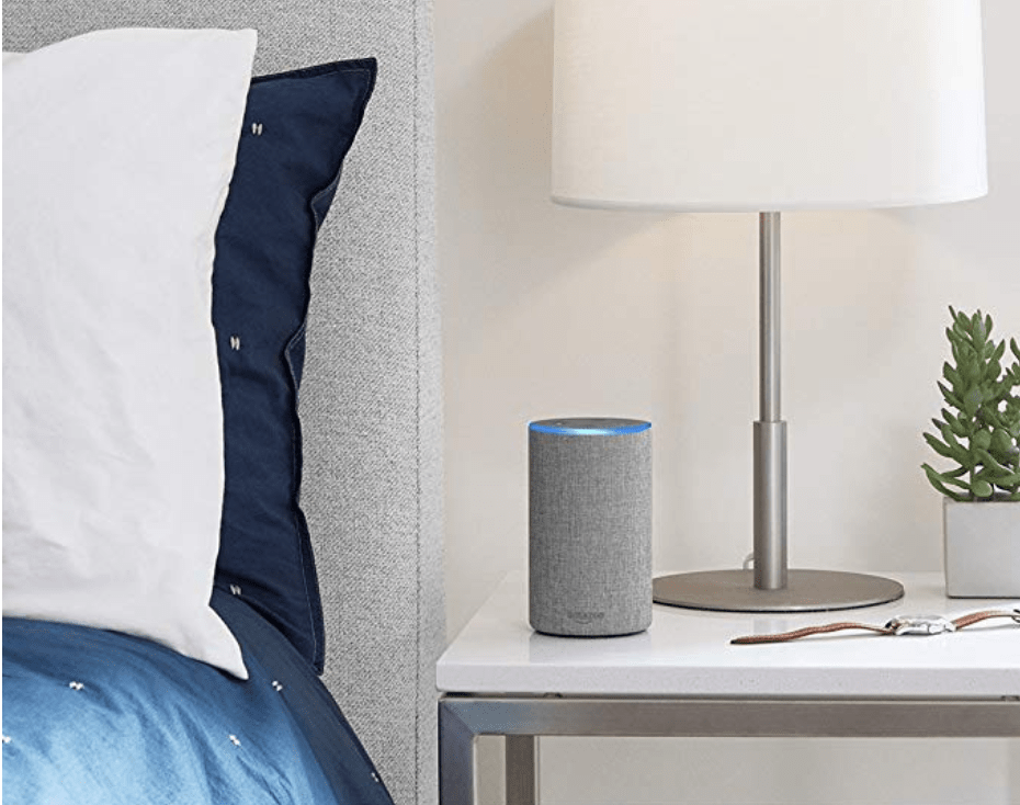
However, there are also some risks involved with VUIs. For example, in terms of accessibility, VUIs will need to be programmed to be able to understand varied dialects and speech patterns of different groups. Skilled linguists are able to recognize the race and age of a person as well as where exactly they come from just based on their voice. Technology can be trained to do this as well and will need to be, as the use of VUIs becomes increasingly prominent.
With VUIs, advertisers will also be able to target users with their ads more precisely. Of course, this is good for companies and marketing teams who are seeking new ways to generate leads but may pose privacy concerns for users.
Probably the most concerning of VUI-related risks is the concern about our technology “eavesdropping” on us, or devices acquiring a lot of data about users that can pose privacy concerns. Combine a tool that ‘listens’ to you with AI and the possibilities can get a little scary…and for some they already have. We forecast that the application of VUIs will continue to grow more in personal contexts before expanding to more public use.
Bonus: Did you know that Qualaroo has an Alexa skill? Get your NPS score or other nudge results in real-time. Learn more.
Another aspect of sensory trends is sound-design. Recently, some members of the UX industry have asked why so many designers have chosen to neglect sound. Research into sound design suggests that it can be used to elicit emotional responses, and emotions can be a major driver of product usage and loyalty. Need to read up on sound design and learn how to use it to your advantage? Check out O’Reilly Media’s new book Designing with Sound.
Why you should care: An increasing use of sensory factors means evolving consumer expectations and of course changing the way we test usability. If gesture-based controls, VUIs, and more intentional sound design become the norm then the UX field will have to adapt accordingly. Related to the prevalence of sensory trends, we expect to see an increased focus on the impact of sensory features on designing multimodal experiences – or combining all types of interfaces within one product/feature.
8. The Trend: AI informing UX
Another trend that we believe will influence the world of UX is the use of AI. Specifically, we predict that websites will continue to learn and optimize based on users’ behavior. You’ve probably heard of the term A/B testing, which refers to a mini experiment with the intention of optimizing a web page, form, or other tools.
These are typically run manually over time by marketing teams or with the help of landing page or marketing automation software like Instapage and Hubspot. We predict that AI will overtake A/B testing tools…because in some ways it already is. Companies like Free Machines are using AI to put optimization of conversion rates, copy, and more into hyperspeed.
Why you should care: Knowledge is power! The more we can learn about our users and the faster we can adapt accordingly, the better experiences we can create. AI can help facilitate and speed up that process.
9. The Trend: Flat → Material design
Another UX trend is a shift toward material design as opposed to flat design. If you’re not familiar with either, there are a few differences. Flat design is, frankly, what it sounds like. The goal of this type of design is to remove any three-dimensional elements or factors that add depth to the image.
Research suggests that flat design is easiest for viewers to understand. One simple and recognizable area this trend has impacted is iconography. If you read Susan Weinschenk’s book 100 Things Every Designer Needs to Know About People, you know that viewers tend to understand illustrations better when they are drawn from a two dimensional/canonical perspective, which means from an angle that is slightly above the item looking down and offset to one side.
On the other hand, material design is a system coined by Google, but anyone can use its principles. Similarly to flat design, material design is rather minimal. However, this design style uses the z-axis. This “design language” came out of the release of Google’s Android OS.
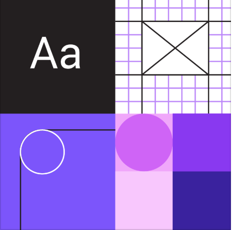
A marked difference of material design is its use of layers theory, or shadowing different boxes and elements. Google’s UI is multi-layered with elevation as a “3rd dimension,” making clickable elements more visible and clearly communicating information hierarchy.
The language has been improved upon since its first iteration with the dawn of material design 2.0. This shift followed the same philosophy as the original but allowed users to be more creative within its guidelines. Basically, Google is empowering material design users to make their designs less boring by giving them the flexibility to add their own flair.
Why you should care: Well, that depends! Some researchers speculate that favoring material design will mean a couple of things: increased engagement with users via animations and more flexibility to customize this design system which means more agency over the design and a native feel. Whether or not you choose to adopt material design is up to you, but we expect to see a lot more of it over the next few years.
Overall, we’re looking to see how these trends in UX develop in 2019 and beyond. Have anything to add? Let us know in the comments!
FREE. All Features. FOREVER!
Try our Forever FREE account with all premium features!


