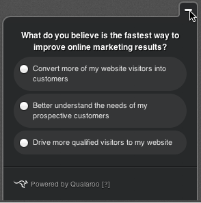
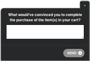
When a customer puts the Qualaroo survey or nudge on their site, it looks like they are running, well… a Qualaroo product on their site! For many websites, especially the ones undergoing rapid changes, having our basic insights and conversion unit, captured below, has been perfectly acceptable, even though the unit’s basic appearance did not resemble that of other components of the site it was running on.

- Basic Qualaroo unit
However, some of our larger more established customers have been wanting to blend Qualaroo into their sites for some time. Motivations varied among the different businesses we talked to. For one segment of customers, the ability to express and control their brand throughout the site was the key factor. Anything featured in a prominent section of their site would have to maintain and promote their brand. As part of satisfying this requirement, we now enable customers to add their company’s logo to their surveys and nudges. When a unit is shown to the user, the logo will appear at the top.
This capability is now available as part of our Professional Plan, and we hope that you will use it in order to brand your own Qualaroo surveys and nudges.
Furthermore, if you are a publisher, you can use the spot reserved for the logo placement as an opportunity to have other brands sponsor Nudges running on your site.
Other segments of our customers determined that they would achieve greater levels of engagement from Qualaroo surveys and nudges if these units could look as familiar to their users as their sites themselves. To fulfill this requirement, we are working on being able to modify fonts and background colors as well.
Which additional aspects of Qualaroo would you like to customize? Please share with us in the comments.
FREE. All Features. FOREVER!
Try our Forever FREE account with all premium features!


