“There’s something intrinsically altruistic about CRO,” Mathilde Boyer, conversion rate optimization (CRO) guru and Conversion Director at House of Kaizen, says. “If you’re not creating aspirations or solving problems, you’re doing it wrong.”
We sat down with House of Kaizen, a digital marketing agency that specializes in CRO, to get their take on what makes users convert. Their model of CRO puts the users’ perspective first. “There’s still a significant amount of marketers who think about CRO in terms of technology, rather than putting the human perspective first,” Boyer says. “CRO is about offering solutions to users’ problems.”
Without a holistic approach to CRO, testing is like throwing darts at a board—with a blindfold on. You might strike the bullseye eventually, but there’s no guarantee you can do it again. House of Kaizen’s three-step method will give you a process for putting your users first and hitting the bullseye every time.
The Burrito Model of CRO
House of Kaizen uses the Burrito Model to explain the purpose of CRO. Your site is like a burrito, with tons of different ingredients. Using CRO identifies which ingredient makes your burrito special—whether it’s the meat, the cheese, or the guacamole that keeps users coming back for more.

[source]
If guacamole is a must-have for your users, add a little bit more. If the type of cheese isn’t doing it for them, switch it up. Thinking of CRO this way keeps your process user-centric. The most important thing in this scenario isn’t the person making the burrito. It’s the person eating it.
Considering your user’s perspective on your website means considering their user journey. House of Kaizen lays out three steps to carving out a compelling path for your users.
- Create segments. Creating profitable segments tracks and categorizes who’s giving you business. This step tells you who to optimize for.
- Craft a dialogue. Before making changes to your site, you have to figure out how to make your users understand the value of your product. This step tells you what you need to say to your segments.
- Maximize engagement. This is when you start testing. Once you craft your dialogue, this step helps you figure out when, where, and how to deliver your messages.
These steps ensure you’re catering to your user’s needs. Guiding users to understand the value of your product helps them just as much as it helps you. It’s ultimately what will increase your conversions.
1. Discover Who Your Users Are
The first step in House of Kaizen’s method is discovering who your users are and grouping them into segments. Different segments are going to need different aspects of your product. Maybe some of the users for your mobile analytics tool are developers, but maybe others are marketers. Before you can optimize for your user segments, you need to figure out who they are.
Luckily, you don’t have to do this through guesswork. With every client, House of Kaizen uses a combination of behavioral and attitudinal tools to discover who their audiences are—including at least one “voice of customer” tool, where they can collect data directly from their clients’ users. They use Qualaroo to survey users on-site, and get “almost subconscious” feedback. “With on-site surveys, we’re catching them in the moment,” Boyer explains, “so they don’t necessarily think about the answer, they just type what they’re thinking.”
There are hundreds of criteria—user intent, product perceived benefits, demographics, to name a few— that you can ask on your surveys to help you create segments. To level up, use branching logic to create very specific, in-depth audiences.
2. Discover What to Say to Your Users
The next step of House of Kaizen’s method is crafting a dialogue—deciding what to say to your segments. Before their CRO experts even touch an A/B test, they think about what they need to communicate. Boyer points out that you only have 8 seconds of attention span to get your message across to your users, so you have to be 100% efficient on what that message is.
House of Kaizen states that persuasive messages do one of these three things:
- Increase their passive gains. Your product should make your user get more benefit from their daily life. For example, messaging about a good mattress could say it improves sleep quality and increases productivity during the workday.
- Decrease their passive pains. Your product should solve a problem for your user. Another possible message about a mattress could say it decreases back pain and reduces the risk of sores.
- Both. Many products simultaneously increase passive gains and decrease passive pains. Another message could say a great mattress reduces tossing and turning and promotes deeper sleep.
Crafting your message is about letting users see how your product will do one of these things. CRO maximizes conversions by increasing the value users see in your product—and this step relieves the anxiety or disconnects present in the messages you’re sending.
3. Discover When, Where, and How to Place Your Messages
The third step of House of Kaizen’s method is maximizing engagement with your messages, which means determining when, where, and how to deliver them so that users are most likely to interact. This is the part most people think about when they think about CRO. In this step, you use a combination of tools to see what connects with your users.
These are some of Qualaroo’s recommended tools.
- Optimizely. Optimizely is a multi-platform A/B testing tool that lets you create experiments without the help of a developer.
- Amplitude. Amplitude is an analytics tool that tracks your user’s behavior and provides web and mobile analytics insights—so you can assess how they’re reacting to your new messages.
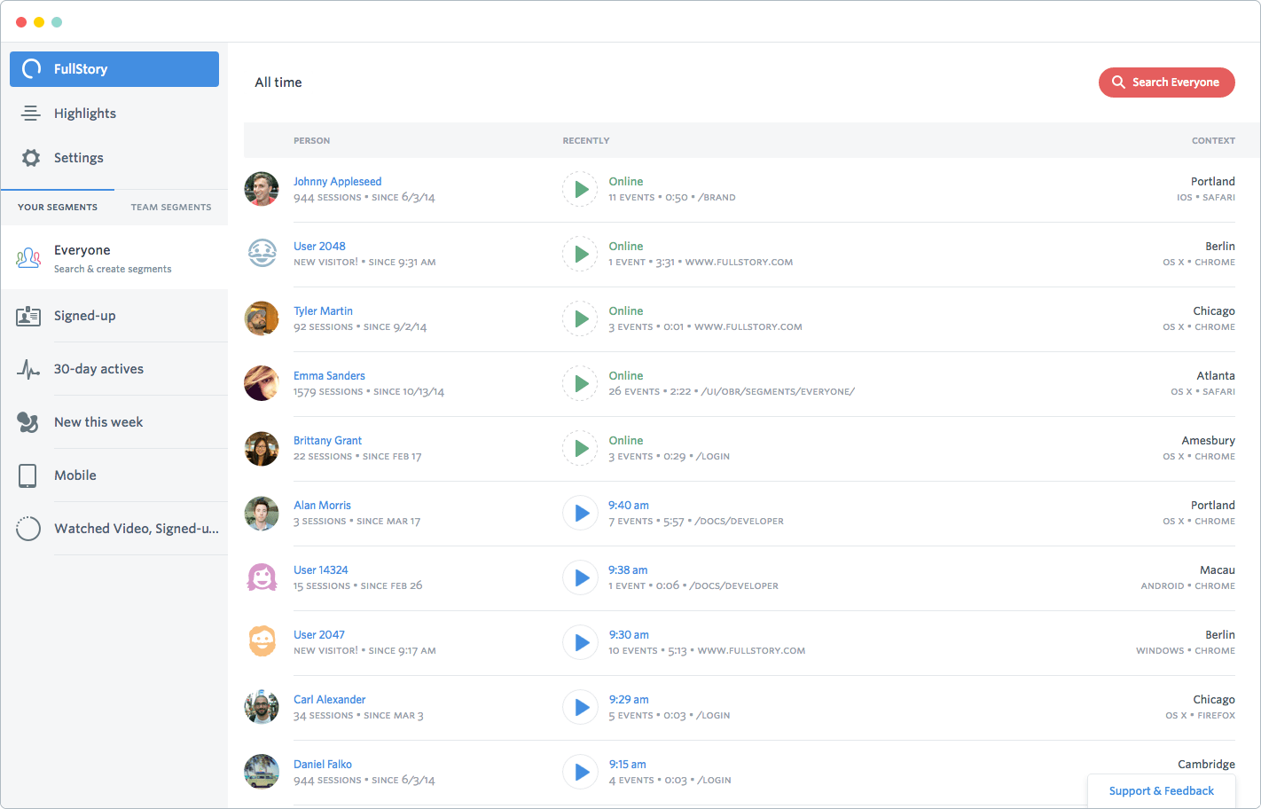
- FullStory. You can use screencasts like FullStory to play back individual user journeys like a DVR to discover how they react to your messages and where they experience friction.

[source]
While all of these tools can help you implement your vision, CRO is more than just changing the color of a button and crossing your fingers. “Your tests are only as good as your hypothesis,” Boyer says. Maximizing engagement is about asking yourself the question, “How can I locate and deliver this message so that it will connect with my segments?”
The answer is different for every product. It isn’t necessarily the name of your subscription that’s preventing users from converting, it could be confusion on your pricing page, or friction in the sign-up process. Your messages could be located at the wrong time, too, like an inappropriately timed tooltip. The point of testing is to discover how to maximize message visibility and engagement for your product to maintain momentum through the sales path—the final step to optimizing conversion rates.
Optimize Your User Journey—Not Your Button Colors
All these steps have one element in common—they’re all about the user. You have to think about your audience, what to say to them, and the best time, way, and place to say it across the entire user journey.
A/B testing a button color might increase your conversion rate a little bit, but considering your users’ entire experience through your site will turn those incremental gains into monumental ones.
FREE. All Features. FOREVER!
Try our Forever FREE account with all premium features!


